Audit existing experience
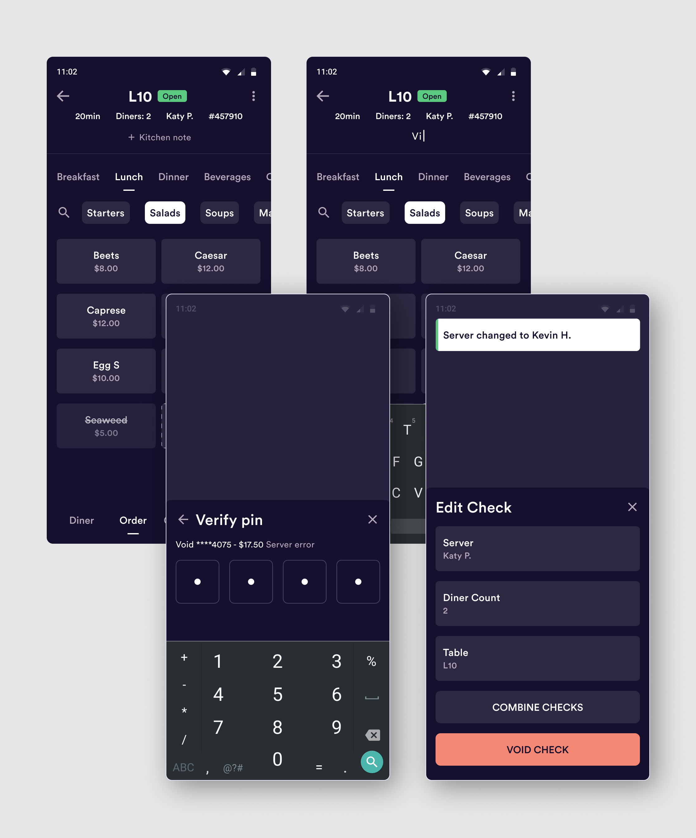
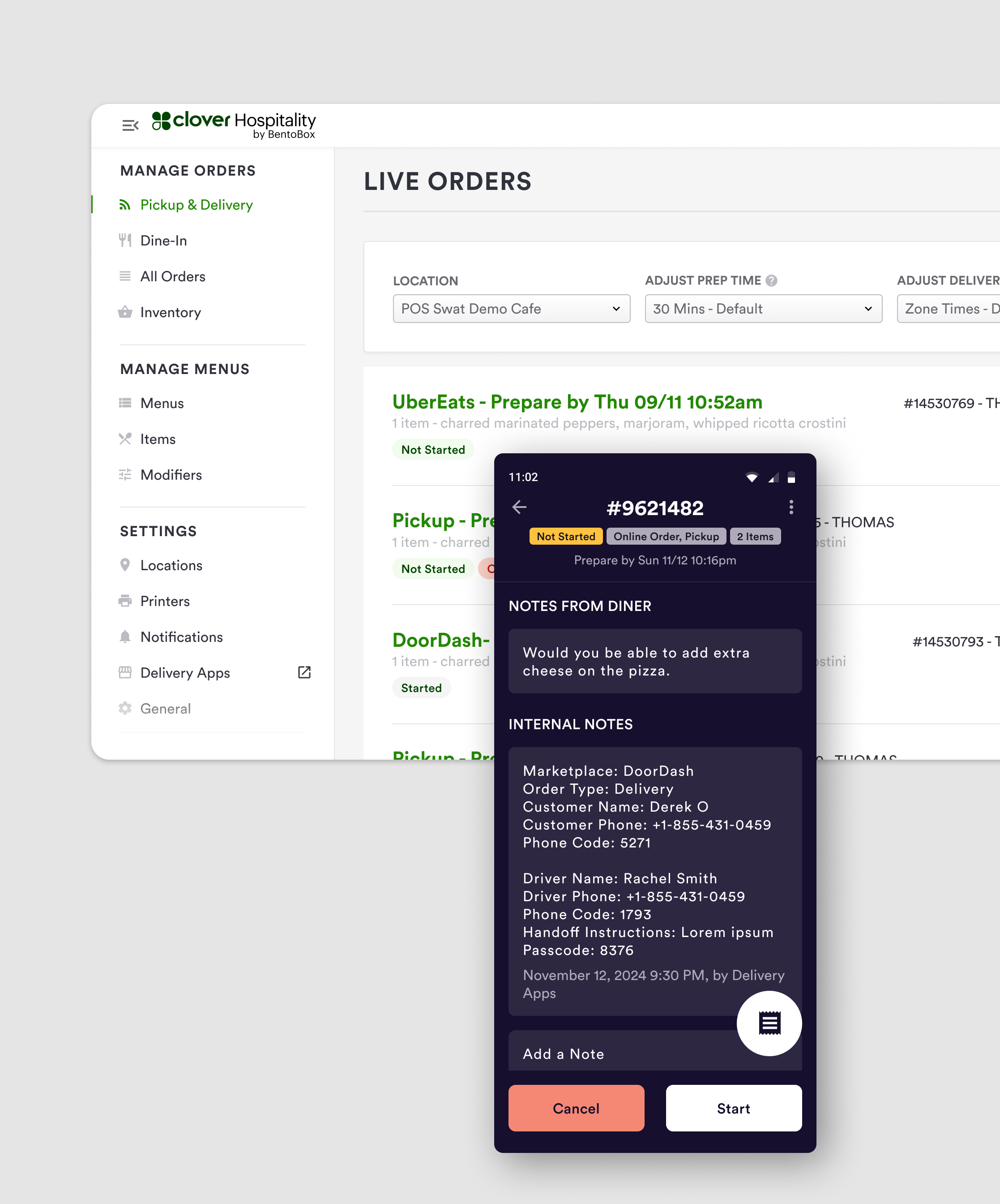
Before I began building the system, I wanted to understand what was currently designed, what was already built by engineers, and how many duplicate components and styles there were in the product. I performed an audit of all the color styles, text styles, spacing elements, and components. This unearthed duplicate elements, but it also helped shape the architecture of the system by showing which areas would need more organization.
Defining system architecture
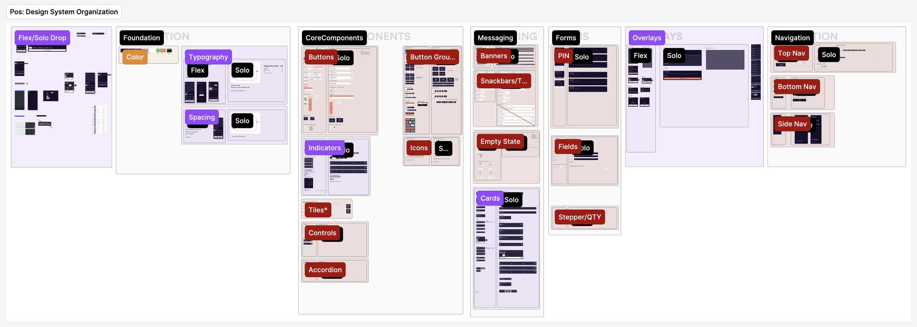
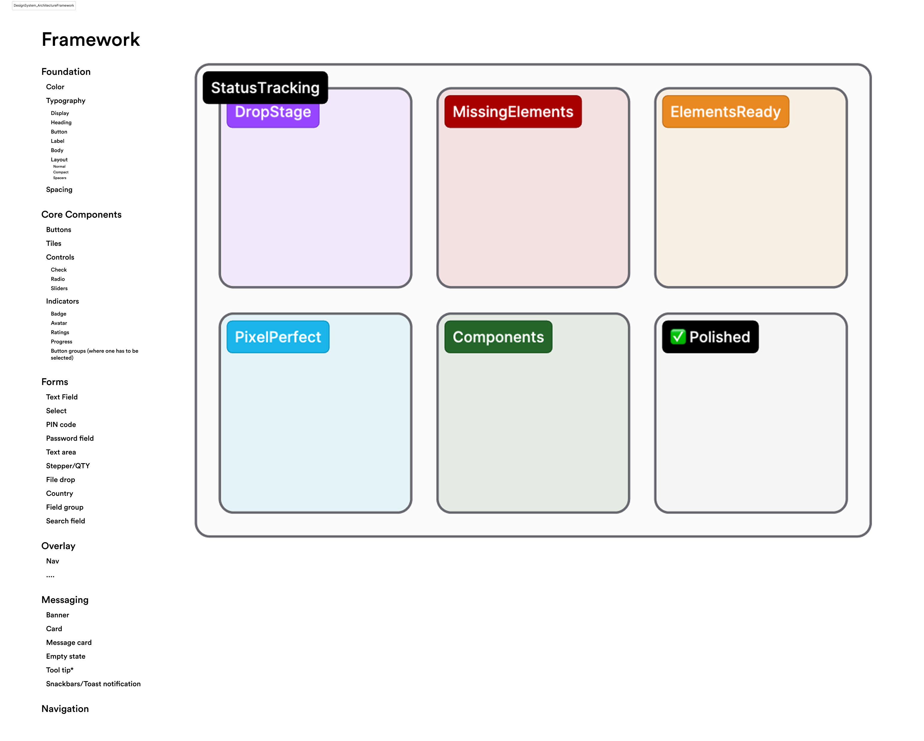
I performed competitive research on other design systems to understand standard system naming conventions and organizational structures. I compared these with the components and styles from my audit to identify which categories best applied to the POS product. I created category buckets to drop components and styles from my audit to determine. This helped me create subcategories and identify where additional categories might be needed.
Design challenges
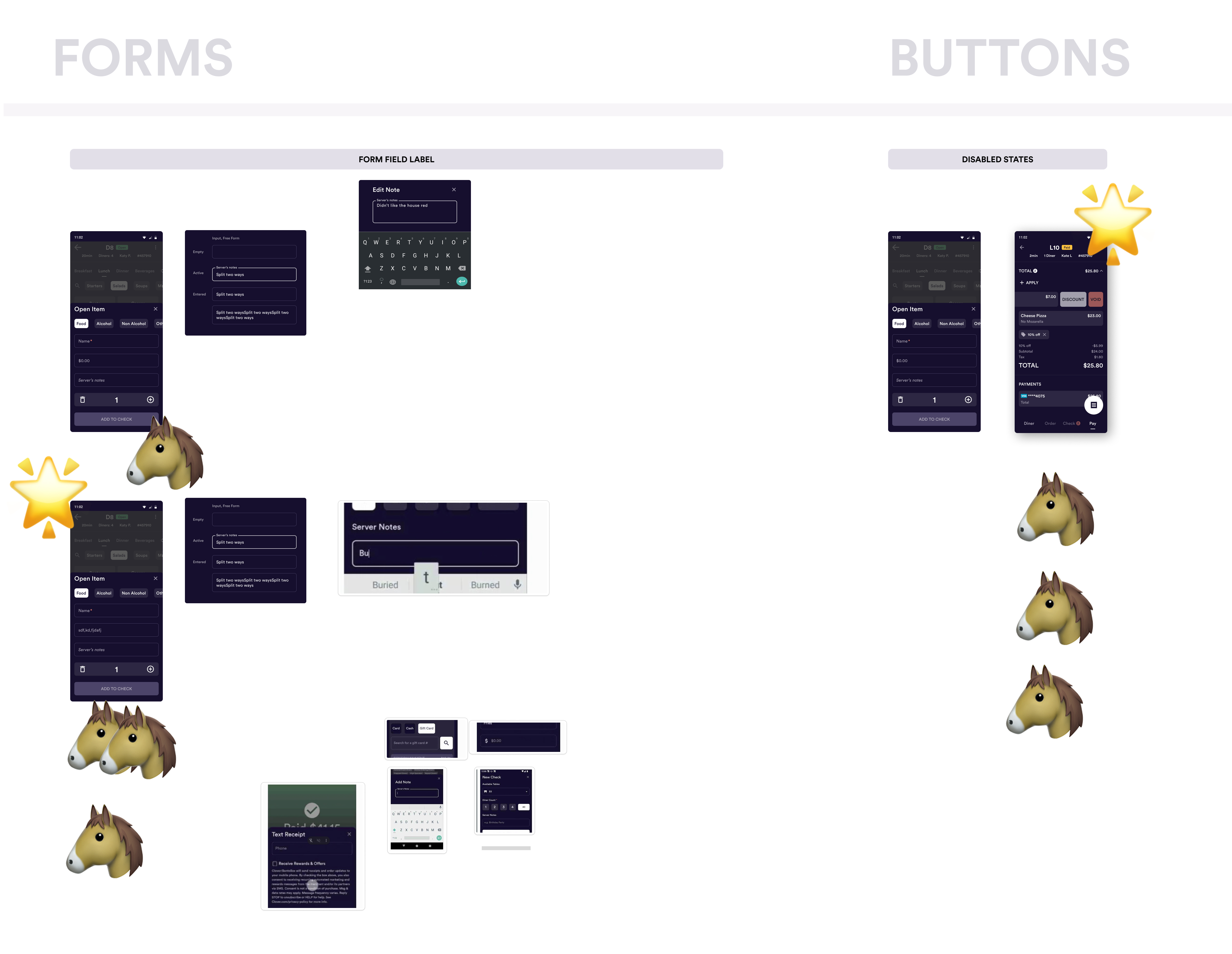
There were two types of inconsistencies that arose from my audit: inconsistencies between designs compared to what had been developed in production and inconsistencies between variations of components and styles. I collaborated with the larger design and engineering teams to compromise on solutions to resolve inconsistencies. I met with the design team to review inconsistencies in production, and if their production solutions were deemed design-approved they were retroactively updated in designs to establish consistency without further slowing down operational efficiency by requiring engineers to revisit duplicate work. For inconsistencies between variations of components and styles, I met with the design team to discuss which styles and components, or combinations of components, should be added to the system as a source of truth (votes were cast with emojis). All inconsistencies that required updates in production were added to backlog tickets for engineering to tackle spread throughout multiple sprints.
Building the system
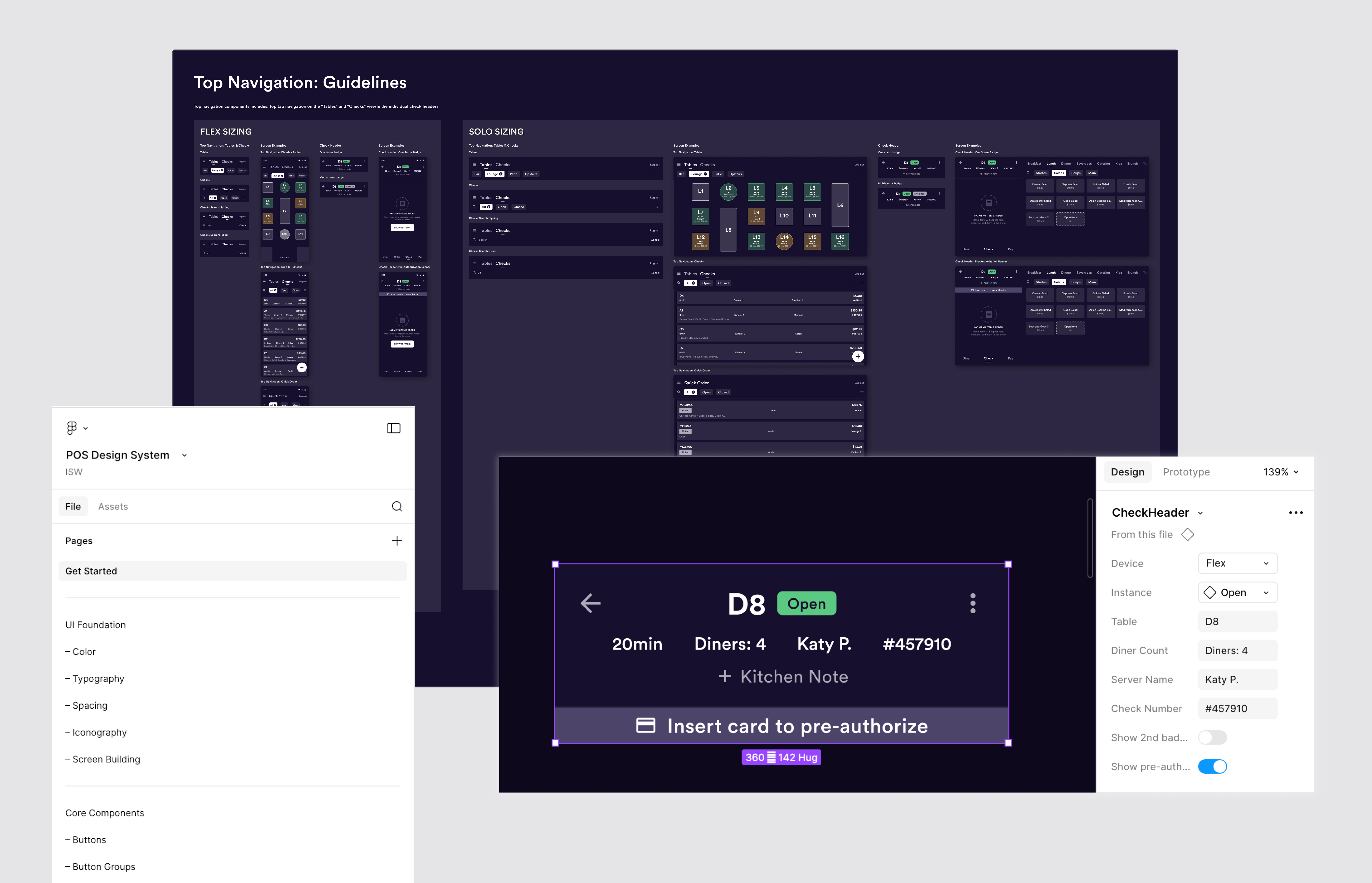
After multiple iterations reviewed with the design team, the system was built with 96 components, 8 color styles, 12 documented type styles, and 8 page templates for designers to have a quick-start when designing screens with common patterns.
Documentation Strategy
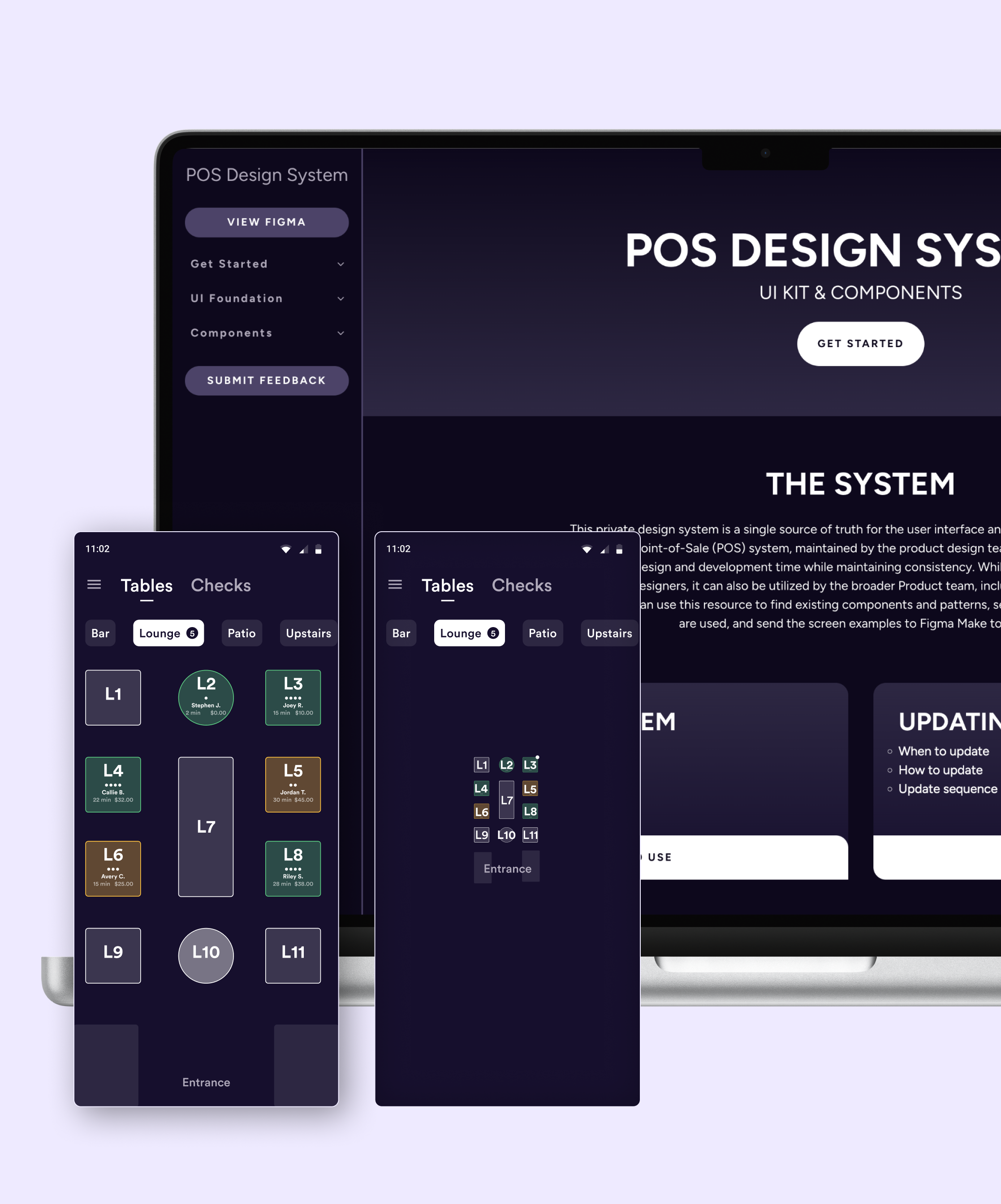
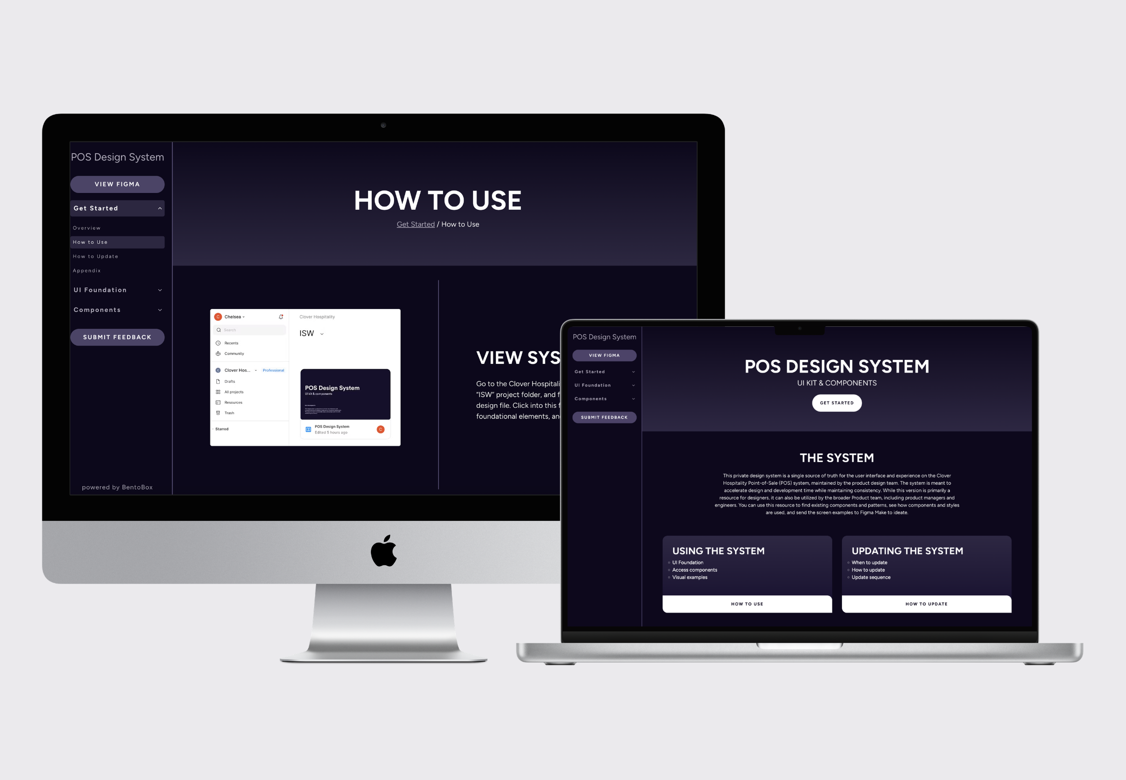
For users proficient in Figma, all categories of the design system included documentation and screen examples of how to apply components and styles. For users less proficient in Figma, a website was created so they could easily view the system and access additional documentation. This was helpful for product design managers who weren’t as comfortable navigating design files.
Adoption & Impact
I assisted in adding the library to all POS-related files, updating all components and styles, and removing old, outdated components and styles to increase adoption of the system. The system received positive feedback and was actively used across the design, product manager, and engineering teams.

Governance
To maintain and improve the system after creation, I created a Google form for all feedback. This form was linked in the design system Figma design file, the internal design system website, and pinned in relevant Slack channels. Simple suggestions were implemented and any reported issues were resolved without team review and reported in the design slack channel. Complex suggestions and new component requests were reviewed with the design team to determine the importance of adding to the system.
Future roadmap
I had meetings with engineering partners to discuss creating a Storybook component library to complement the system, but developer resources were spread thin during the creation of the system. Currently, developers benefit from the system by receiving fewer duplicate requests from designers who have implemented the system. Developers can also view the Figma design file to reference documentation on where any previously built code lives in different areas of the product. The next major roadmap item would be to create a Storybook component library so developers could fully benefit from the system as well.